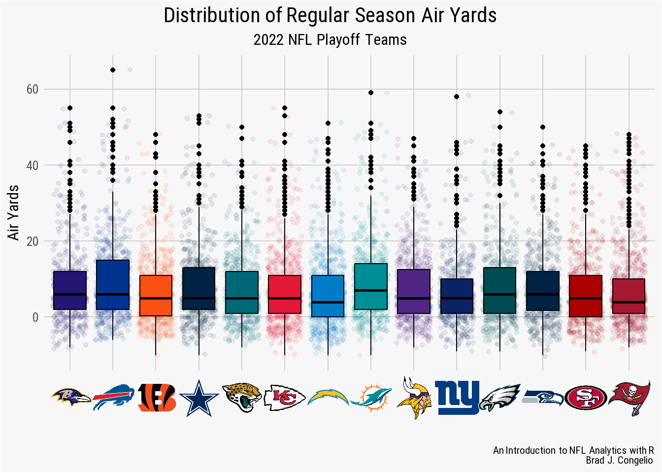
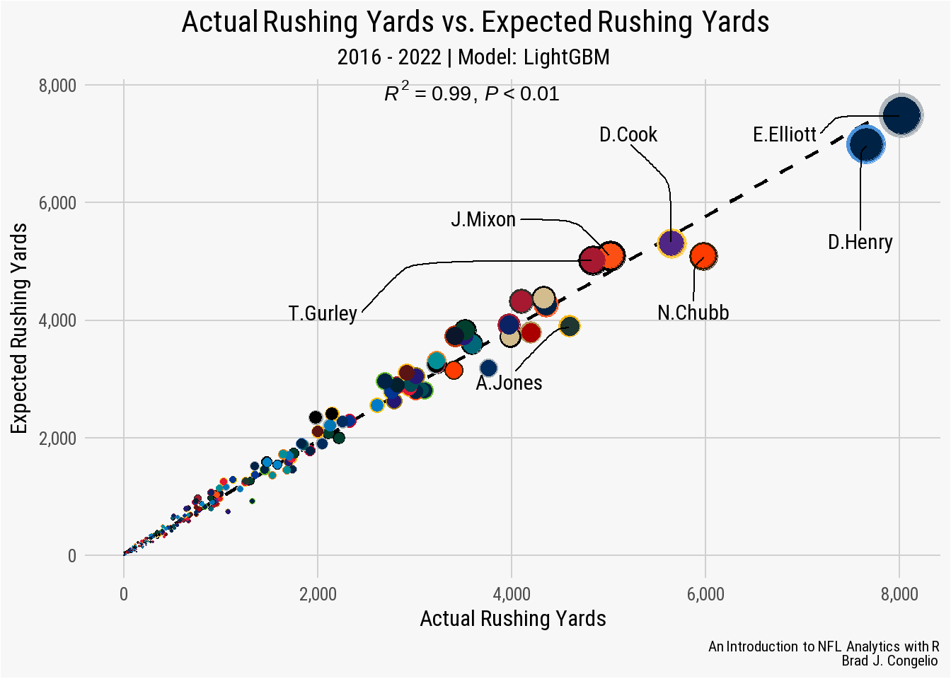
Alright, folks, let’s dive into something I’ve been messing around with lately – analytics in the NFL. I’m no expert, but I’ve always been a huge football fan, and I love tinkering with data, so I thought, why not combine the two?

First, I needed to get my hands on some data. I mean, you can’t do analytics without, you know, data. So, I started poking around, and I found a bunch of websites. Some of them wanted money, which, no thanks. I am looking for some free data, and finally got it.
Getting My Hands Dirty
Once I downloaded the data (it was a massive CSV file, by the way), I needed a way to actually look at it. Excel is okay for basic stuff, but this was a beast. So, I fired up my Rstudio. I’m most comfortable with it, though I’ve heard Python is pretty popular for this kind of thing too. No fancy machine learning, for God’s sake, I even don’t know what exactly it is, just some basic data wrangling and visualization.
The first thing I did was load the data into R and started cleaning it up. There were missing values, weird characters, and all sorts of messy stuff. It took a while, but after a few hours of wrestling with the `dplyr` and `tidyr` packages, I had something that looked reasonably usable.
Finding Some Interesting Stuff (Maybe?)
Now for the fun part – actually exploring the data! I started by looking at some basic stuff, like average passing yards per game, rushing touchdowns, and things like that. Nothing groundbreaking, but it was cool to see the numbers laid out in front of me.
Then I got a little more ambitious. I started looking at correlations between different stats. For example, is there a relationship between a team’s time of possession and their win percentage? (Spoiler alert: there is, kind of, but it’s not as strong as you might think). I spent hours generating graphs and charts. Honestly, most of them were pretty useless, but every now and then I’d stumble upon something that made me go, “Huh, that’s interesting.”

- I plotted passing yards versus points scored. Expected a strong correlation, and yep, it was there.
- Checked out rushing attempts versus rushing touchdowns. Again, pretty obvious, but satisfying to see.
- Tried to get fancy and look at third-down conversion rates versus wins. It’s there, but not as clean as the others.
It’s a Messy, Fun Process
The whole experience has been a bit of a rollercoaster. There are moments where I feel like I’m actually uncovering some hidden secrets of the NFL, and then there are times where I’m just staring at a bunch of numbers, wondering what it all *’s definitely a learning process, and I’m sure there are people out there who are way better at this than I am.
But hey, it’s been a fun way to combine my love of football with my interest in data. And who knows, maybe one day I’ll actually discover something truly insightful. Or maybe I’ll just keep generating pretty charts that don’t really tell me anything. Either way, I’m having a good time.
If any of you have messed around with NFL data, I’d appreciate that you could share your experience with me. It’s always cool to see how other people approach this stuff.
