How This Power Stats Mess Started
So this morning I saw my power bill, right? Hurt me bad. Got me wondering: Is it just me getting robbed, or is Victoria really worse than other places? Honestly felt like Victoria was losing this battle. Had to get some real numbers. No theories, just cold, hard facts.
The Deep Dive Into Confusing Government Sites
First thing I did? Hit up the official energy regulator sites. Big mistake. Found myself clicking through like five different state websites – NSW, Queensland, South Australia, you name it. Felt like falling down a rabbit hole. Each site looked totally different, used weird labels for the same stuff. Like, one calls it “Peak Demand,” another calls it “Maximum Load” – come on! Needed coffee just to stay awake. Spent over an hour trying to match apples to apples.
Noticed a few things immediately:
- NSW data was buried under layers of PDFs. Actual nightmare.
- Queensland had nicer graphs but zero downloadable stuff.
- South Australia kept bragging about renewables – okay we get it.
- Tasmania? They mostly do hydro, hard to compare fairly.
My Spreadsheet Prison
Gave up on the websites eventually. Decided to pull the trigger and download every CSV file I could find. Dumped it all into one massive Excel sheet – almost 5000 rows. My laptop sounded like it was gonna blow up. Spent forever trying to align dates and units. Why can’t everyone just use megawatts? Found myself manually converting gigajoules for one state. Seriously? Painful. Used some gross formulas just to get hourly usage and prices side-by-side for Victoria vs NSW vs Queensland. Looked messy as heck.
Victoria’s Surprise Report Card
After all that sweat, pressed ‘sort’ and actually gasped. Victoria? We ain’t the worst! Middle of the pack, honest truth.
- Household Prices: NSW actually edged us out slightly this quarter. Go figure.
- Blackouts: We’ve had fewer major outages than Queensland lately. Those storms clobbered them.
- Green Stuff: Okay, SA stomped everyone. Wind farms killing it. We’re behind NSW too here, gotta admit.
- Peak Times Strain: Found out Queensland plants work harder than ours during summer peaks.
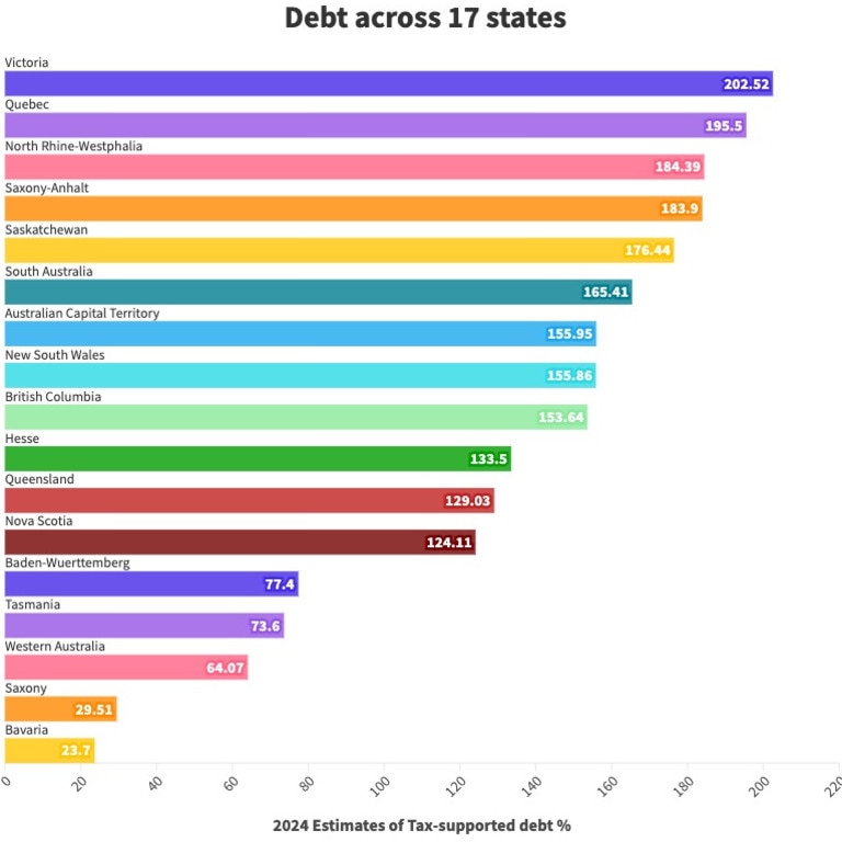
The Ugly Truth Chart
No fancy tools. Just copied my final numbers and pasted them into basic bar charts right inside Excel. Coloured Vic in orange, other states in blues and greens. Honestly? It was a jumbled mess at first. My partner walked in and was like “What is that even showing?” Had to redo it three times just to make the key comparisons pop out – mainly prices versus outages versus renewable %. Printed it out. Stuck it on the fridge next to the grocery list. Feels more real that way.
What It All Means (For Me Anyway)
Guess I learned something hard today: assumptions suck. Vic’s got room to improve, for sure, especially on clean energy. But we’re not the basket case I thought. Still paying too bloody much though! Think I’ll track this every quarter now. Maybe next time I’ll check wholesale prices vs retail… nah, I ain’t that mad yet. Bills hurt, numbers help.